
Eversource Website Testing
Description
Eversource is an energy utility company and is New England’s (Maine, Vermont, New Hampshire, Massachusetts, Connecticut, and Rhode Island) largest energy provider. They were our project sponsor and we were in contact with a few members of their UX team throughout the project to provide updates and gain feedback. This was a group project focusing on User Testing. The problem with the current website was that some of the features were not immediately intuitive and they could be implemented in a slightly different way to make them better. On pages like registration, there was no UX work done at all. So the goal of the project was to identify issues on a few pages, namely, Registration, Onboarding, Account History, and Alerts of the Eversource website, and provide recommendations for the same.
Methodology
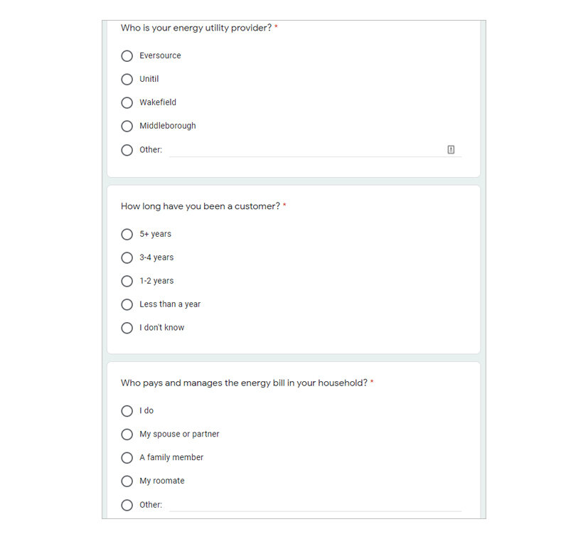
A plan was created to lay out all the high-level details of the project so that there is a clear idea of what all has to be done. Expert Reviews (Heuristic Analysis) were conducted by each member of the team to individually identify the issues on each of the pages. Jakob Nielsen’s heuristics (1994) were used along with a few basic accessibility guidelines. Each issue identified was given a rating to find its severity. Again, Jakob Nielsen’s severity scale (1994) was used. Our data was combined to create a list of all the issues identified on each page and a severity rating was given to all of them. To confirm if users faced the same issues, and to identify other issues they faced, a Usability Test was conducted. A Participant Screener (image below this on the left) was sent out to people to select those who met our criteria (for e.g. if they were Eversource customers or not, etc.). For the usability test, a moderator’s guide (image below this on the right) was created to help during the interview process and think-aloud protocol was used for the tests. Once all the data was collected, we analyzed it to find the common issues faced by our participants. Based on our findings, we created a low-medium fidelity wireframe demonstrating our recommendations for the issues.
Participant Screener

Moderator’s Guide
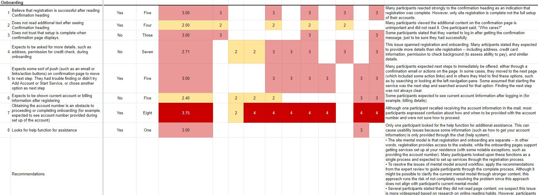
To store and analyze our data, we used an adapted version of the Rainbow Spreadsheet which was originally created by Tomer Sharon (2013). The image below shows our version of the spreadsheet. In the first column, each issue is noted. The middle section shows the severity of each issue, the average severity for all the participants (column 4), the number of participants affected (column 3), and whether it was noted in our expert review (column 2). The rightmost column shows our description of the issue and at the bottom, there is a row for our recommendations. Findings were noted in this manner for all four pages.
Data Analysis
Through our expert review, we identified the following key issues with the Eversource website, 1 – Registration and Onboarding had disconnected flows and did not provide guidance for setup, 2 – Complicated top and left navigation menus, 3 – Some of the options were difficult to understand and no support was provided. Key findings from the usability test include 1 – The mental model of the users was not in line with what the website offered, 2 – The alerts page was difficult to find as users got lost in the left and top navigation menus, 3 – Options like status filters and a few alerts were difficult to understand. Most of the issues identified in our expert review were also found in the usability tests. Detailed findings for both the expert review and the usability tests along with our recommendations can be found in the report linked below.
Redesign
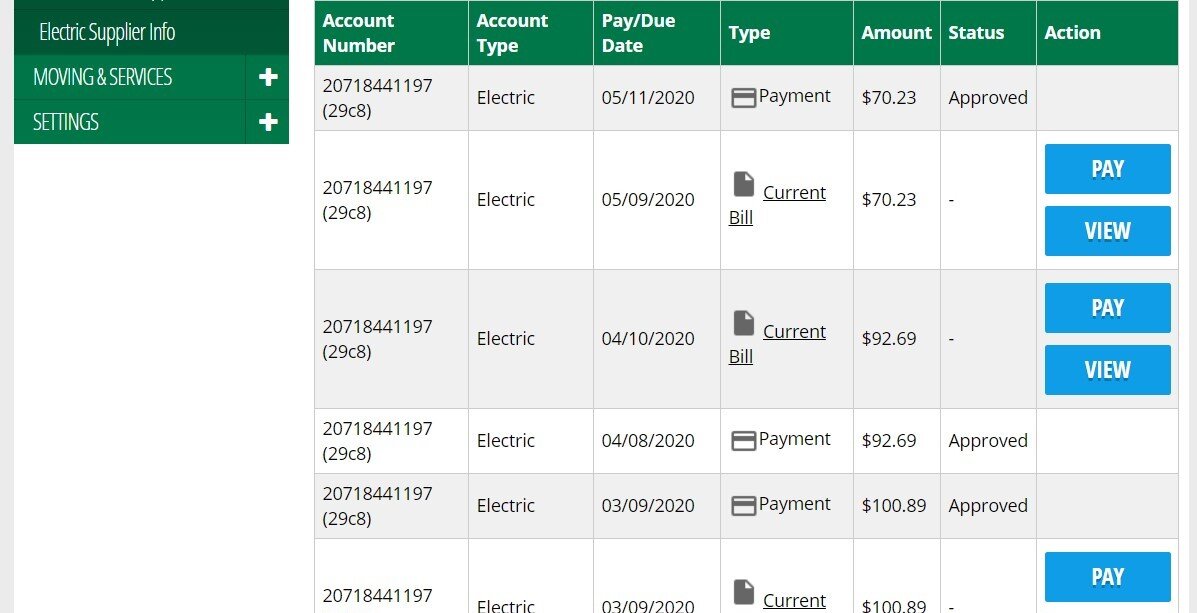
We tried to demonstrate our recommendations for the most common problems with the help of the wireframes. They were annotated to explain our suggestions. This image on the right shows our recommendations for the account history page. One of the problems in the current website (image on the left) is that the table is a bit difficult to understand as there are two rows for each bill, one for the actual bill and one for its payment. Our redesign (image on the right) tries to solve that problem by keeping just one row for each bill and showing its status in the same row. The current website only shows the status of payments.

Results
As mentioned earlier, we were in contact with the Eversource UX team throughout the project. They had mentioned that currently they don’t have enough time to work on our suggestions because of other priorities. Thus, while providing recommendations, we separated them according to ‘Quick Fixes’ and ‘Long-Term Fixes’. Quick fixes were issues that could be solved without putting in a lot of time but would still improve the experience significantly. We decided to separate the recommendations in this manner so that Eversource could start working on the quick recommendations and take more time to think about the long-term ones. After presenting our recommendations to the Eversource team, they were very happy with the separated recommendations. Some of the Quick Fixes included 1 – Validating Email ID, User ID, and Phone Number fields on the spot, 2 – Simplifying and rewording the status filters. Some of the Long-Term Fixes included 1 – Redesigning the table on account history page to make it more understandable, 2 – Rethinking the registration and onboarding process such that the users know what to expect at each step. Detailed recommendations can be found in the report linked below.
Next Steps
The next steps for this research would be to think about whether the approach in our wireframes is the correct one to solve the problem or a better design solution could be developed. Once the design is finalized, another round of testing would be needed to see if the users find it easier to use than the current website and if it indeed solves the issues identified by us. It would also be important to find out if the new design creates any additional issues.