
Blackboard Redesign
Description
Blackboard Learning Management System (LMS) is a platform used by many universities to support the process of teaching and learning. Professors can upload notes, assignments, etc. and students can access them. This website was chosen because the current website has a lot of extra features and not all of them are used frequently. It becomes difficult to find the required items quickly and there are also multiple redundancies. Through my redesign, I wanted to address some of these issues and try to make the website easier to navigate. The goal of the project was to analyze the blackboard website using 10 heuristics to find out 10 issues, provide recommendations for them, and demonstrate the changes with the help of a redesign.
Methodology

10 heuristics were selected from multiple sources including books and academic papers. After identifying the heuristics, a Persona was created, and a Task Flow was developed based on the persona. The image on the left shows the task flow. Using the heuristics, the screens were redesigned to improve the overall experience of completing tasks. The redesign included sketches, wireframes, and a medium-high fidelity prototype. Whimsical was used to create the wireframes and Adobe XD was used to create the prototype.
Heuristics
The 10 heuristics selected were, Flexibility-Usability Trade Off, Thumbnail Grid, List Inlay, Aesthetic-Usability Effect, Feature Search and Browse, Color and Contrast, Corner Treatments, Clarity, Consistency, and Privacy. These heuristics were selected by keeping in mind the problems faced while using blackboard on a regular basis. Explanation about each heuristic can be found in the detailed report linked below.
Redesign
Annotated sketches were created to explain the redesigned elements.


The image on the right shows one of the wireframes created. There were a few minor changes made to some of the screens while creating the wireframes. At the wireframe stage, color wasn’t used so as to direct attention towards the elements and their positioning instead of the design. And finally these wireframes were converted to medium-high fidelity prototypes.

One of the heuristics is Flexibility-Usability Tradeoff. It states that “As the flexibility of a system increases, the usability of the system decreases” (Lidwell, Holden, Butler, 2010, p.102). This suggests that if more flexibility is added to a system to increase features/options available to the user, its usability decreases. Even though this seems counterintuitive, adding more options increases the complexity. There will be too many options for the user to choose from which will increase the cognitive load. Out of the two screens on the left, the the top one has too many tools available. Most of these tools are never used and don’t need to be displayed on the homepage. The redesign on the bottom keeps only the important elements and moves infrequently used elements to a different page.

Another heuristic is Thumbnail Grid. The heuristic states that “Arrange a list of visually interesting items into a ‘small multiples’ grid of thumbnail images. Let the user select one or more thumbnails to view or manage those items” (Tidwell, 2011, p.210). This principle suggests that when the items have small visual representations that uniquely identify them, they can be organized into a grid. These unique elements can be images, logos, screen captures, etc. Out of the two screens on the right, in the top one the course recordings page organizes the items in a list view which requires the user to scroll a lot to find the items at the bottom. A grid view in the bottom image reduces the scrolling required by arranging more items on the screen. The images below show some more redesigned screens. The entire list of recommendations can be found in the detailed report linked below.


Results
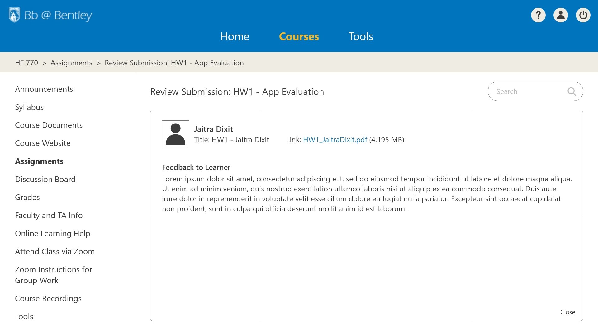
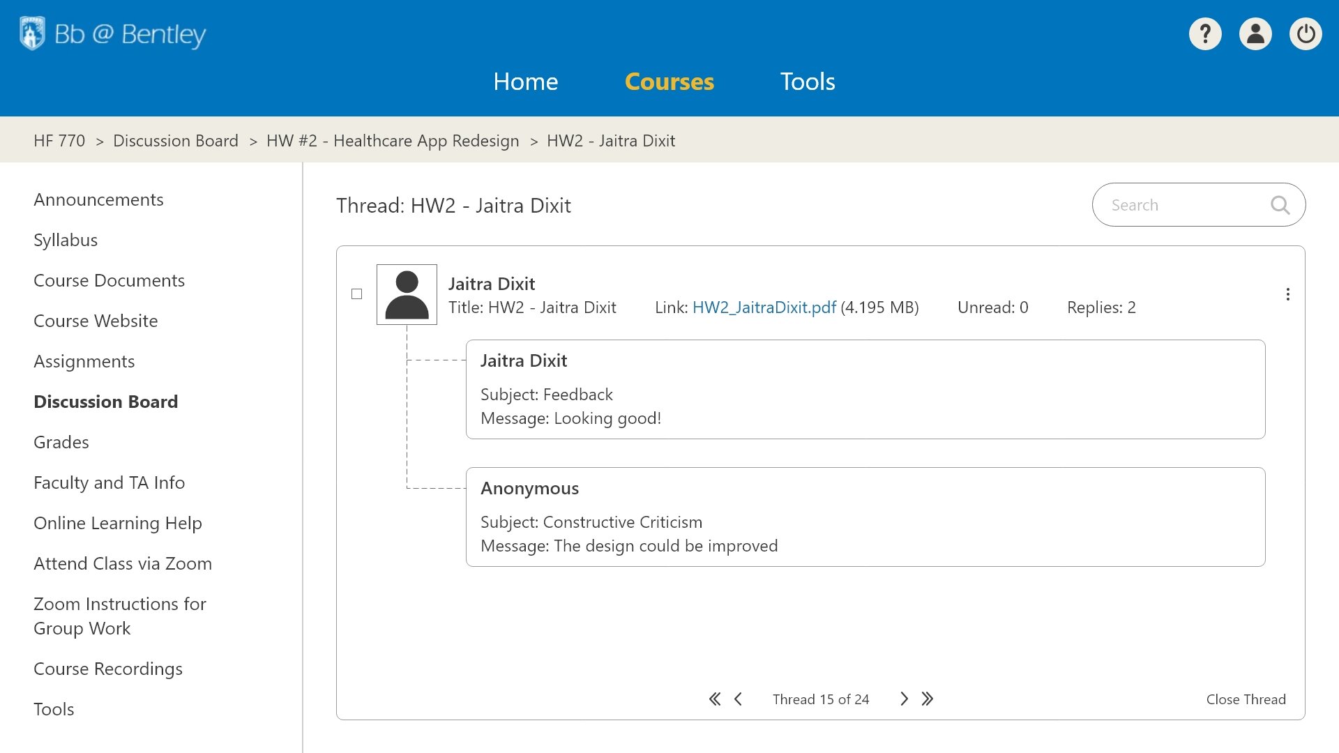
The major findings were, 1 - Too many tools and customization options, 2 – Long lists on multiple pages to display information, and 3 – Privacy of students while posting comments or replies. All three of these issues were addressed in the redesign. Recommendations for the first two findings were explained above. For the 3rd one, there was a checkbox added during replying to posts which asked if the user would like to post anonymously. This would solve the problem of providing constructive criticism anonymously. Overall the website was made more usable by eliminating some of the extra options from each screen and grouping all the infrequently used tools to a separate page. The final prototype was made interactive and can be found here: Blackboard Prototype